

Infrastructure
The Infrastructure tab is your server-inventory and optimisation workspace. It works straight after discovery (no workload mapping required) because it runs on Dr Migrate's signature mapping. A left sub-navigation moves you between Snapshot, Servers, Optimization and Storage, adds VMware when the scan includes VMware hosts, and groups the cloud-native views (AWS, Azure and Databricks) under Cloud Services. Click any server in the Servers view to open its Server Drawer.
Snapshot
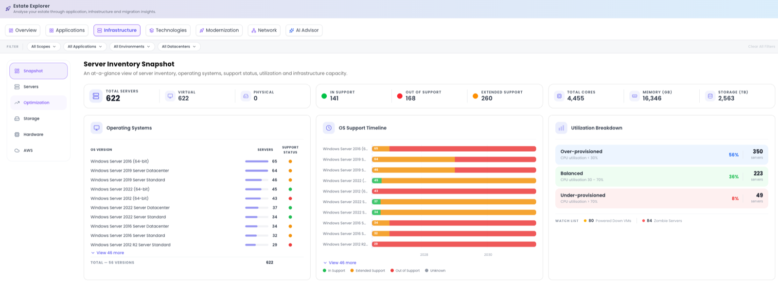
Snapshot is the infrastructure at a glance. Headline tiles cover Total Servers split into Virtual and Physical; support status as In Support, Out of Support, Extended Support and Unknown; and capacity totals for Total Cores, Memory and Storage. Below the tiles:
- Operating Systems: the OS families present across the estate.
- OS Support Timeline: when those operating systems fall out of support.
- Utilization Breakdown: servers grouped as Over-provisioned, Balanced, or Under-provisioned.
- Watch List: machines that warrant a closer look, including Powered Down VMs and Zombie Servers.
Servers
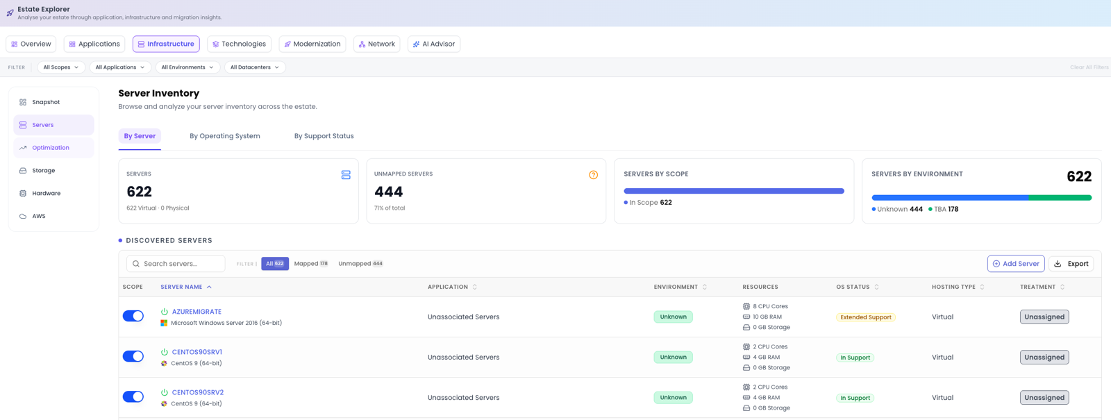
Servers is the full discovered inventory. Three tabs reframe the list (By Server, By Operating System, and By Support Status) and tiles summarise Servers, Unmapped, In Scope and a breakdown By Environment. The Discovered Servers table carries these columns:
| Column | What it shows |
|---|---|
| Scope toggle | Bring a server in or out of scope. |
| Server Name | Click to open the Server Drawer. |
| Application | The application it's mapped to, if any. |
| Environment | Where it runs. |
| Resources | Cores, memory and storage. |
| OS Status | In, out of, or extended support. |
| Hosting Type | Virtual or physical. |
| Treatment | The current 6R treatment. |
Add Server lets you define a machine manually, and Export takes the list out. Clicking a server name opens the Server Drawer.
Optimization
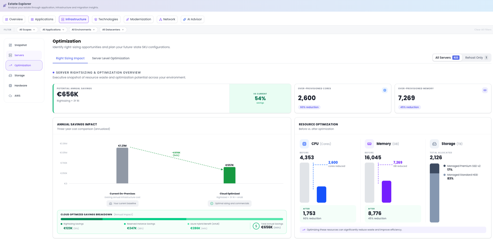
Optimization is the core of the Azure cost story. Two tabs (Right Sizing Impact and Server Level Optimisation) and a scope toggle between All Servers and Rehost Only let you focus on where right-sizing is actually the lever. The headline Potential Annual Savings compares your right-sized Azure cost, with 3-Year RI (Reserved Instances) and Azure Hybrid Benefit applied, against taking the on-premises footprint as-is. It quantifies over-provisioned cores and memory, shows before/after for CPU, Memory and Storage, and breaks the saving down by source: Rightsizing, Reserved Instance and Azure Hybrid Benefit.
As you assign more 6R treatments, the Rehost Only scope isolates the workloads where right-sizing genuinely applies, sharpening the savings number.
Storage
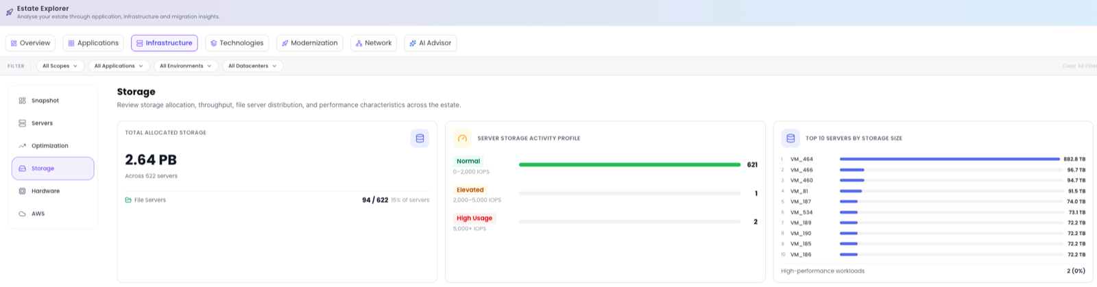
Storage profiles where data lives and how hard it works. It shows Total Allocated Storage and the number of File Servers, then a Server Storage Activity Profile that classifies servers by IOPS as Normal, Elevated or High Usage. The top servers by storage and a full Storage Inventory table let you find hot-spots and plan disk tiers.
VMware
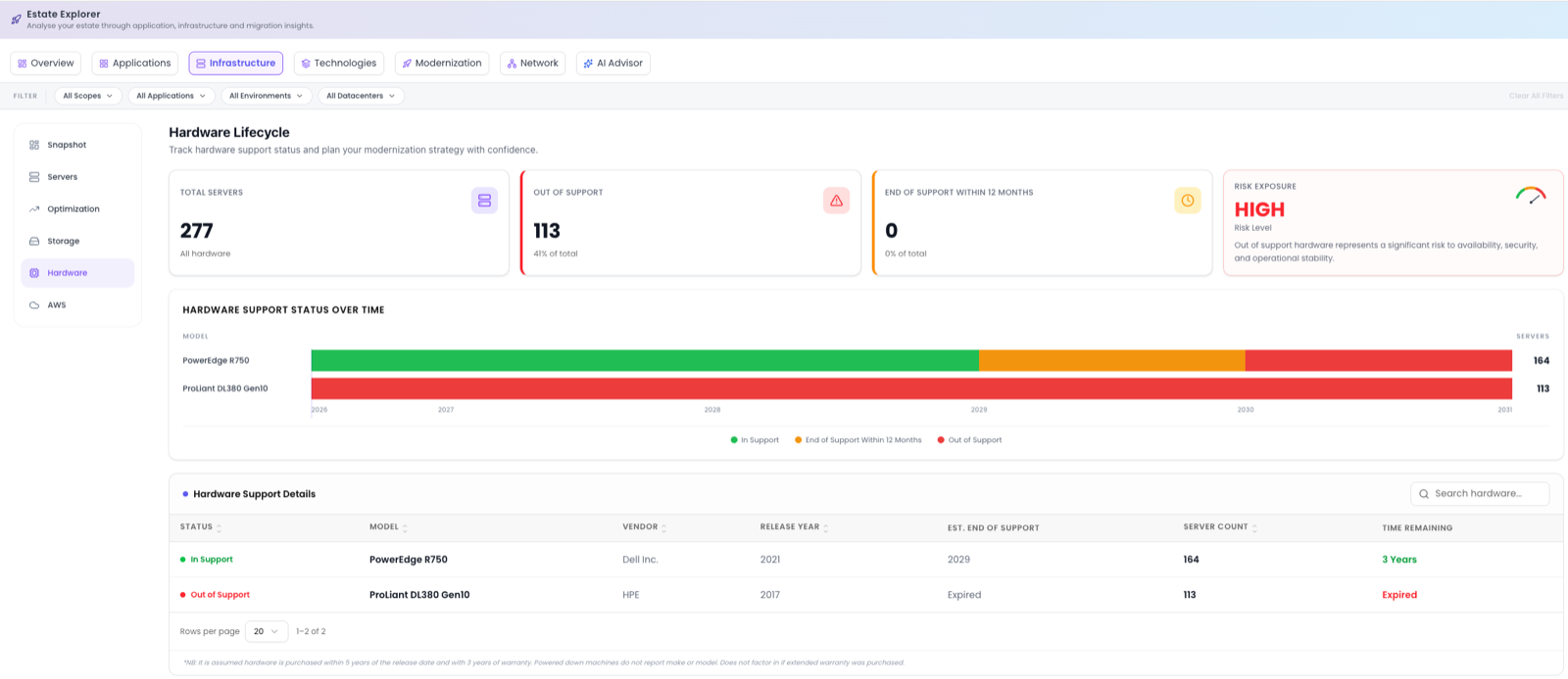
The VMware sub-section checks the VMware hosting layer against support baselines, providing useful evidence for a refresh-or-migrate case. The Hardware Lifecycle tiles cover Total Servers, Out of Support, End of Support within 12 months and overall Risk Exposure. A Hardware Support Status Over Time chart shows how exposure evolves, and the Hardware Support Details table lists Status, Model, Vendor, Release Year, Est. End of Support, Server Count, Host Count and Time Remaining.
Hardware support dates are estimated from model and release year against typical support baselines; the exact warranty start is not always known. Treat these as indicative rather than contractual.
AWS
Where DMC has scanned an AWS estate, the AWS view shows what the scan found, where each AWS service and resource moves on Azure, and a like-for-like cost estimate for everything that can be priced. An AWS account select and a Region select at the top apply to every tab, and Clear returns both to All. Four tabs organise the section (Overview, Resource explorer, Transformation and Cost Insights), with a Refresh Estimates button at the right of the tab row. Until a DMC AWS scan has been uploaded, the view reads No AWS environments have been scanned; see Scan AWS for how to run one.
Overview
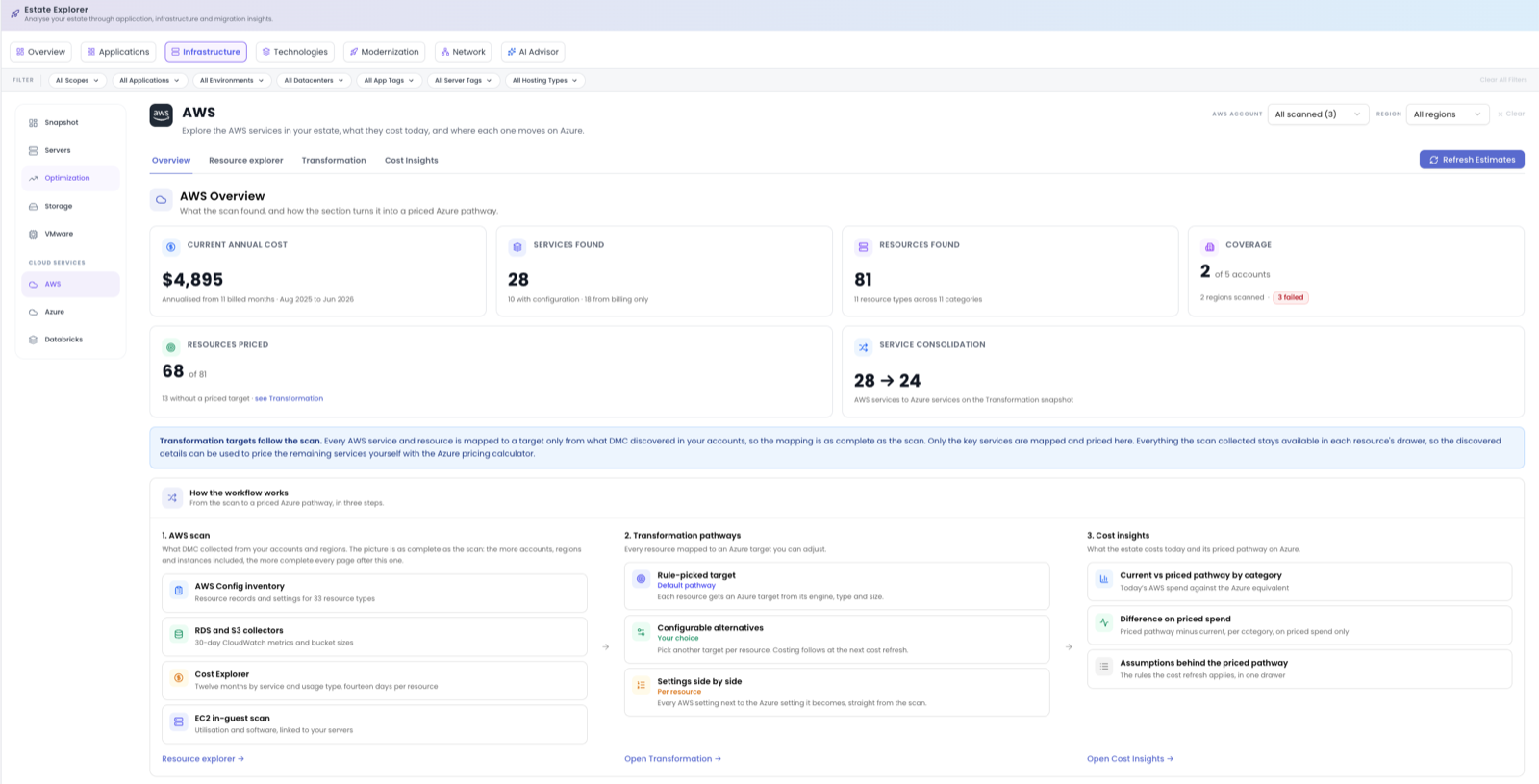
Overview is the scan at a glance. Tiles cover Current annual cost from the monthly bill, with the billed months it is based on; Services found, split into services with configuration and services known from billing only; Resources found; Coverage, as accounts and regions scanned with a badge for any account that failed; Resources priced; and Service consolidation, how many AWS services become how many Azure services. A How the workflow works card walks through the three steps from scan to priced pathway. Improve your scan coverage lists the changes to make in your AWS accounts (Action, Where, Why and Unlocks) so that the next scan covers more; after making them, re-run the DMC scan and upload it.
Resource explorer
Resource explorer draws AWS Config relationships (attached, associated and contained) as a map in six columns: Network, Gateways, Subnets and routing, Interfaces and security, Compute and data and Storage and other. Solid nodes were observed by AWS Config. Dashed nodes are known only from a relationship and were not collected. Lines are structural relationships, not traffic. Narrow the map with Search, Region and Type, then select a node to see its identity, tags and connected resources in the side panel; Open details opens the resource drawer. The map draws up to 300 resources at once, so a larger estate asks you to pick a type, region or search term first.
Transformation
Transformation maps every scanned AWS service to its Azure pathway. The side menu opens on a Snapshot (each category with its current cost per year, the AWS services it holds today and the Azure services they become) and expands each category into its services; only services found in the scan are listed. A category page shows Where each service moves, a flow card whose connector width follows current cost. A service page adds a coverage badge, tiles for Current annual cost, Priced pathway and Resources, and an inventory with two views:
- Resources: one row per resource with Name, AWS resource type, Transformation target, AWS run rate /yr, Transformation estimate /yr and Difference. The target dropdown is the only thing you edit in the section: pick another Azure target and the choice is saved with your name and time. Cluster members inherit their cluster's target and are read-only. The eye icon opens the resource drawer, which shows the target, every AWS setting next to the Azure setting it becomes, and the raw AWS Config item and collector record.
- Cost Summary: the service's Current AWS cost by month from the bill, beside Priced pathway by selected target.
Badges state how far the collected data goes:
| Badge | Meaning |
|---|---|
| Configuration, Cost only, Not collected | Service coverage: resource records were collected; only the bill knows the service; or DMC does not collect this service. |
| not collected | No resource-level billing rows for this resource, so it has no AWS run rate. Service and category totals still come from the monthly bill. |
| not priced | The resource has no priced Azure target. |
| not available in region | The chosen target has no price in the assessment's Azure region. |
| Amber dot | The target changed after the last cost refresh, so the estimate is pending. |
Changing a target doesn't update the costs straight away. The row shows an amber dot and the header reads Latest changes are not costed yet. Refresh Estimates to recalculate. Press Refresh Estimates to recalculate. It runs the same cost refresh as TCO Analysis, so the button reads Refreshing… on both pages until it finishes.
Cost Insights
Cost Insights compares AWS against Azure for the resources that can be priced from collected data. The header badge reads Full Azure estimate when every resource has a priced target and Partial Azure estimate otherwise, and a coverage callout links to the unpriced resources. Tiles show Total current AWS spend, Pricing coverage (priced resources out of all resources), Included resources · annual cost (AWS against Azure for the same resources) and Difference for included resources. A chart and the Cost and coverage by category table compare the two clouds per priced category, each labelled "n of m priced", and billing-only categories are listed under Not included in the Azure estimate. Download Full AWS Report exports the AWS summary, and Pricing assumptions opens the rules the cost refresh applies, including the region, payment model and Hybrid Benefit taken from TCO settings.
Unpriced spend never reads as a saving. The estimate and the difference cover only resources with a priced target, and coverage counts resources, not the share of AWS spend. Only key services are mapped and priced; everything the scan collected stays in each resource's drawer, so the remaining services can be priced with the Azure pricing calculator ↗. Treat the estimates as sizing guidance, not a quote. Figures use the assessment's currency once the first cost refresh has run.
Azure
The Azure view is the inventory of Azure-native services DMC discovered across your subscriptions. It fills once an Azure resource discovery scan has been uploaded; until then it reads No Azure environments have been scanned and links to Scan Azure. Two tabs organise the view: Service Explorer and Cost Explorer.
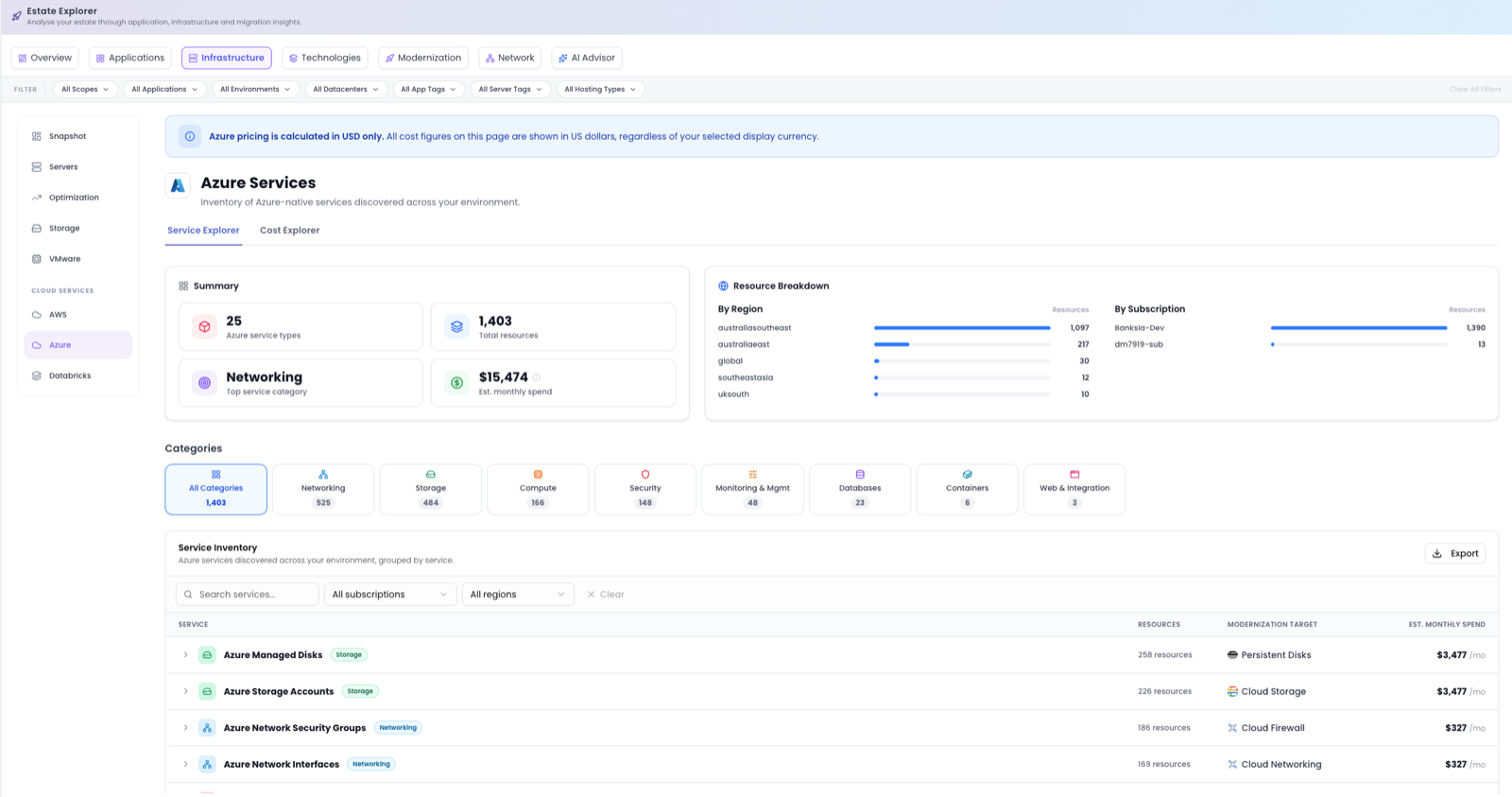
Azure pricing is calculated in USD only. Every cost figure on this view is in US dollars, regardless of the display currency selected for the assessment.
Service Explorer
A Summary card counts Azure service types and Total resources, names the Top service category and gives the Est. monthly spend. Beside it, Resource Breakdown splits the resources By Region and By Subscription. Categories tiles (Networking, Storage, Compute, Security, Monitoring & Mgmt, Databases, Containers and Web & Integration) filter the Service Inventory below, which groups every discovered resource by service and shows the resource count and estimated monthly spend per service; on an assessment that targets Google Cloud, a Modernization Target column names the equivalent service. Search, subscription and region filters narrow the list, Export takes it out, and expanding a service lists its resources, each with a View configuration action that opens the resource's configuration and observed cost.
Cost Explorer
Cost Explorer is the Azure spend profile. Tiles cover Annual Azure Cost, Azure Services incurring cost, Azure Subscriptions and Azure Regions with cost. A Service Cost Breakdown lists the top ten services with their share of the total, and Top Regions by Spend and Top Subscriptions by Spend show where the money goes. Download Full Azure Report generates the Azure summary report.
Databricks
The Databricks assessment is in private preview. Until a Databricks scan has been uploaded for the assessment, the view carries a Private Preview badge and an Assess your Databricks estate card instead of the screens below. To register interest, use Contact Dr Migrate Support on that card or see Support.
The Databricks view sizes a Databricks estate from a read-only, metadata-only collection taken by the DMC Databricks collector. No table data or query text is ever collected, and data enters only through a DMC scan. Six screens cover the estate:
- Overview: headline KPIs, the consumption split by product, and a coverage ledger showing which workspace snapshots the current estate was merged from.
- Consumption & Cost: monthly DBU consumption over the last twelve months, the SKUs behind it, and what the spend attributes to (top clusters, top jobs, pipelines and serving endpoints).
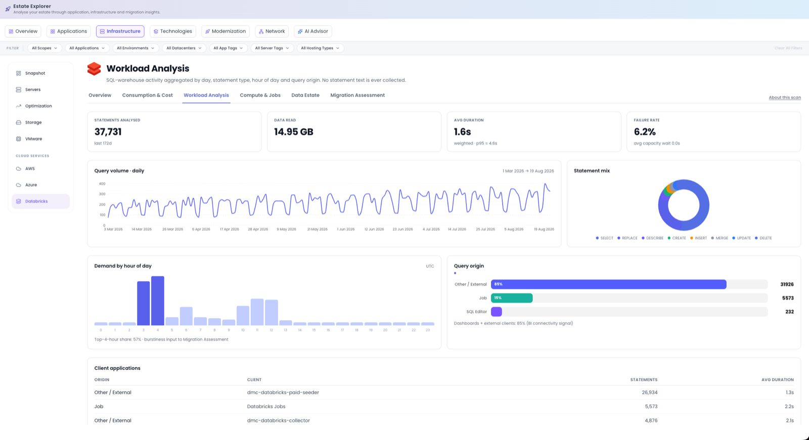
- Workload Analysis: SQL-warehouse activity with Statements analysed, Data read, Avg duration and Failure rate, then daily query volume, the statement mix, demand by hour of day (UTC), query origin and the client applications behind it.
- Compute & Jobs: clusters, node types, workspace utilization (collected per workspace per day, so there is no per-cluster CPU or memory figure), job runs and SQL warehouses.
- Data Estate: catalogs, schemas and object counts across the metastore. Sizes, formats and storage locations are not collected.
- Migration Assessment: one row per Databricks product in use, mapped to candidate services on the assessment's target cloud with the evidence each mapping rests on. These are candidates, not recommendations.
Screens that show money carry a notice that costs are in DBUs with list-price estimates in USD: DBUs multiplied by the current list price, excluding discounts and the underlying cloud VM and storage spend for classic compute. About this scan, at the right of the screen tabs, opens the scan health panel, which lists for each collection pass what was Collected and what was Not collected, with the reason.
The Server Drawer
Open a server from the Servers view and the Server Drawer gives you everything about that one machine. A set of left tabs (AI Advisor, Server Overview, Installed Software, Networking, and Target Azure Config) covers configuration, software and target sizing.
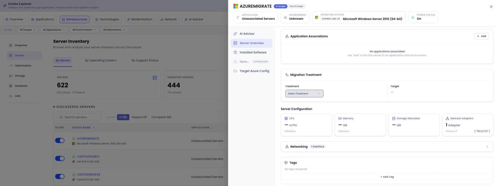
Server Overview
An In Scope / Out of Scope toggle, top-line details (Application, Environment, Operating System, Power Status, Hosting Type), Application Associations (with Add to map it), Migration Treatment (a Treatment dropdown and Target), a Server Configuration summary (CPU, Memory, Storage Allocated, Network Adapters), and Tags.
Installed Software
A Software by Domain summary groups detected packages into categories such as App Stack, Platform Service and Security. Below it, the full Installed Software Inventory table lists Software Name, Version, Publisher and Category, with search to find a package quickly.
Networking
A dependency-mapping view with three sub-views: Application Flows, Internal Server Flows, and Connection List.
Application Flows shows a visual diagram of the server's connections to other applications, with flow counts. Clicking a connected application opens a detail card with Servers, Total Connections, Inbound Connections, Outbound Connections, and a Connected To list. Below the diagram, an Application Dependencies table lists each connected application's Direction, Servers, Dependencies, Wave, and Incoming/Outgoing traffic.
Internal Server Flows shows connections between the servers within the same application (an empty state explains when an application's servers don't talk to each other, pointing to App Dependencies or Traffic Flows instead).
Connection List gives the full detected network connection list for the application, with summary tiles for Inbound, Outbound, Total Connections, Peer Servers and Risky Ports, and a detailed table (Direction, Source Server, Source IP, Dest Server, Dest IP, Port, Protocol, Source Process, Dest Process, Risky Port, Cross-Wave) that can be exported.
All three sub-views share filters for search, connection direction, technologies, environments, wave, port and connection type.
When an Azure or AWS scan has been loaded, the cloud services this server connects to appear by name (for example Azure SQL) with the Azure or AWS icon in Application Flows and the Connection List. See Cloud service nodes on the Network page for more.
If estate changes have been made since the network data was last refreshed, an amber Network data last refreshed banner appears at the top of the tab. Click Refresh network data; the tab reloads after a few seconds and the banner disappears. See Refreshing network data.
Target Azure Config
Where you shape the Azure target. It sets the Target Azure SKU, vCPUs and Memory; a Data Disks table (Disk Name, SKU, Size, Type); Payment & Licensing preferences (Payment Model (for example 3 Year Reserved Instance), Region, a Dev/Test Pricing toggle and a Hybrid Benefit toggle); and Azure Features (Disaster Recovery, Backup and Defender for Cloud toggles), with an Estimated Monthly Cost.
Changing the Target Azure Config updates cost projections across the server, its application and the estate-wide optimisation numbers.
Where to go next
To see what those servers are running, head to Technologies; to assess Azure suitability, see Modernization.